UX + UI // Product Design // Graphic Design

Friendbuy Referral Marketing Platform

Introduction
Getting to Know the Project

ROLES
UI/UX, User Research, Branding, Copywriting

TOOLS
Figma, Adobe

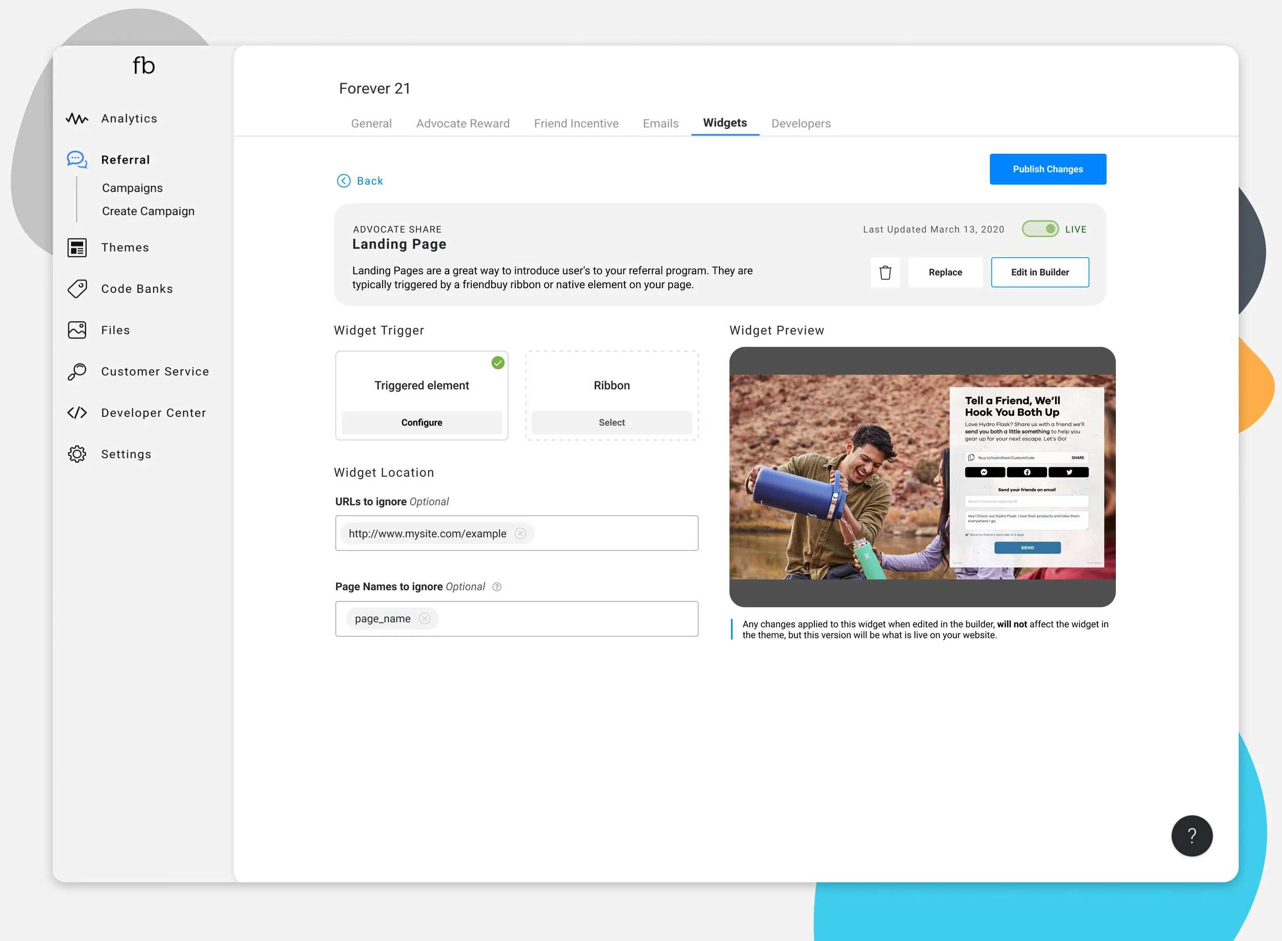
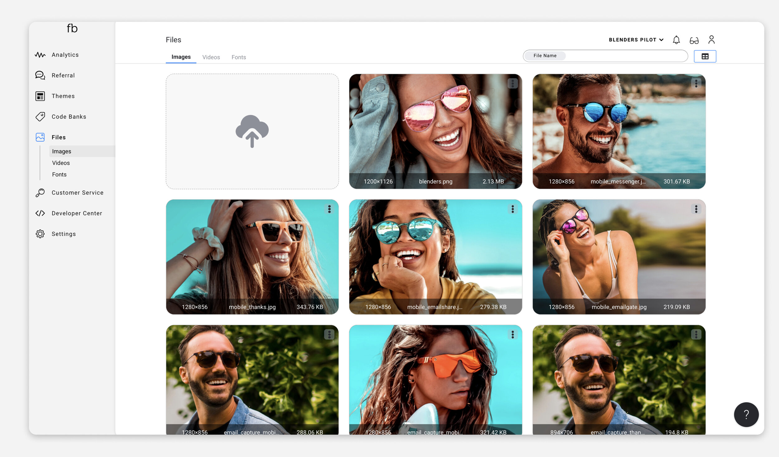
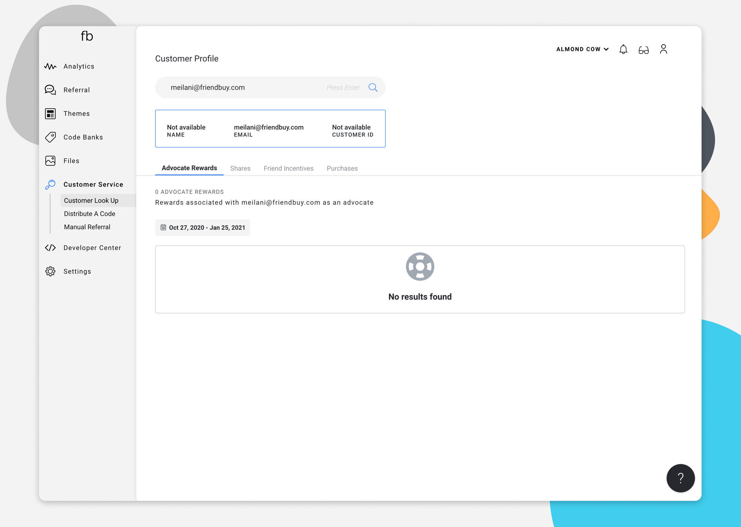
The new Friendbuy platform handles a wide range of marketing tools. It does everything from creating iframe based landing pages and pop-ups for email capture and sharing capabilities, has custom email sending functionality as well as analytics tracking, coupon code banks, and referral campaign management all in the same platform. 

Login.jpg
 

PROJECT BRIEF

  • We worked with the client to complete a full-scale rebranding, recreating the existing Friendbuy platform and reimagining this outdated backend referral marketing platform.

  • Based on user data we collected on the old platform, we knew the designs would need to be heavy on analytics, and accessible to an older account manager user base.

  • Desktop Centric Web App similar to platforms like Shopify, or mail chimp that manage everything in a complex yet easy to use space.


GOALS

  • Create a pleasant and clean branded experience for account executives, designers, and developers to create referral marketing experiences on their own websites.

  • Easy to use for clients who are not very good with technology, yet maintaining the complexity that is required for these technically dense programs.


Our Core User Personas


The Account Manager and Marketer

  1. Occasional User / 42 yrs / Erie, PA

  2. Marketing professional that “has better things to do” than manage a referral marketing campaign.

  3. Has no technical skills, but has a lot of technical implementation that is required for their role.

Needs

  1. Retrieve analytics on how their program is converting.

  2. Manage campaigns, and advocate/friend reward coupons.

  3. Save time by having everything as quick to access as possible.

Frustrations

  1. The account manager doesn't want to have to worry if the program is working right, they just want it to work.

  2. Things in the past have been really hard to find.

  3. They hate waiting, making the platform usable with less clicks is a must. In fact, they would prefer to reduce their time on the platform to move on to other projects.

Devices

  1. Uses a laptop computer, only really knows how to use web browsers.

  2. Sometimes uses an iPad, but rarely uses their mobile device to get work things accomplished other than long client calls.

The Friendbuy Staff

  1. Core User / 31 yrs / Los Angeles, CA

  2. The heart and sole of the business they work for, needs to be on this platform all day to manage hundreds of clients individual campaigns updates, creation and QA before things go onto the live client site.

  3. Has some technical skills, can code the basics, but would rather out of the box features that make their job faster.

Needs

  1. Manage campaigns, change offer strategies, check implementation status, manage rewards (coupon code banks).

  2. Quickly switch between clients accounts.

  3. Test everything, from the landing pages to the emails that will be apart of their marketing campaign.

Frustrations

  1. There is no easy way to create or edit landing pages or pop-ups. Currently every change other than text changes needs to be done by a developer.

  2. Be able to do every aspect of client’s requested changes to their program from one side of the platform (rather than things being on an admin platform, then the client facing platform).

  3. Current platform is difficult to use, too many steps to get to where they need to go.

Devices

  1. Uses a small laptop for work, but some have at least two gigantic monitors (so x-large to x-small window scaling is important to keep in consideration for this project).

  2. Constantly on their phone, checking the live version of their landing page and pop-up creations.

The Design System

Branding

Key Words

  • Bright, clean, savvy

  • Friendly, inviting, unintimidating

From these simple words we explored many options for what the platform would look like, from brightly colored brands that tried to grab your attention at every turn to simple designs that made the older crowd feel at home. We landed this shinny new theme you see here that feels sharp and precise while you still get that relaxed feeling like an empty email inbox.

DesignSystem.jpg

From Inputs to Error messages

Important Little Pieces
There are so many things that go into a full platform product design, every piece, every message, notification, user flow, and click must be considered and designed to industry standards. Here’s to the little things in life!

Style Guide Continued.jpg
Style Guide Continued2.jpg
 

High-Fidelity Designs & Testing

Before any production is able to be done, there had to be step by step, click by click mock-ups to review, test, and get approval on.

Products within the Platform
There is one thing about this platform that never seemed to end, the complexity. It’s not a one service product, so there are many pieces to this puzzle. The new “FBOT” platform handles a wide range of marketing tools.

It does everything from:

  • creating iframe based landing pages and pop-ups for email capture and sharing capabilities,

  • has custom email sending functionality,

  • analytics tracking

  • advocate and friend reward coupon code banks

  • and campaign management

all in the same platform.

User Testing with Prototypes

One of the most fun parts of this process has been the product testing days. After portions of the design had been prototyped on Figma had gained approval from stakeholders, our team was small enough that we had the privilege of going straight to development so we could test our users in a real functioning environment.

Back and forth we went, group testing environments of 25 people or more each time. Laying out tests and key tasks that they had to accomplish. Constantly we were learning what works and didn’t, what was confusing and what made people’s lives easier after years of asking for a similar solution. I had the pleasure of leading one of these meetings on a regular basis and this process went on for about 2 years as we were able to create and develop more and more of the platform.


Final Designs

Please enjoy a selection of product screens from this project.

Screens are in the order a user would go down the side bar, starting with the analytics dashboard and ending with the settings screens.

Frame 483.jpg
Frame 497.jpg

FYI if you get a chance to look at the widget builder design, this is the way you get to it above, you start in themes and then you are able to create individual widgets in those themes which you manage and open editing capabilities from this screen.

Frame 485.jpg
Frame 486.jpg
Frame 488.jpg
 

CONCLUSION

Reflecting on the project.

What did I learn?

  1. It's important to manage client and stakeholder expectations from the beginning of a project, but to not get into the weeds too quickly. Doing so overwhelms people quickly, when discussing things at a higher-level it creates better collaboration and a more wholistic designed approach.

  2. In terms of user interface and user experience, it's crucial to test early and often.

  3. Users will always find a way to break things, and create use cases you could have never dreamed of. Creating a never ending ability to iterate, improve, and polish.

What are the next steps?

  1. Iterate design based on user data and feedback.

  2. Find new ways the platform can be leveraged to help create a more seamless product for all the client, staff and developers out there.


Explore the Widget Builder UI/UX